Summarizing quantitative data using R
In a previous article, we outlined how you can summarize qualitative data using frequency tables and bar graphs. We now turn our attention to quantitative variables and their numerical, and graphical summaries.
Let’s load the data we had used in our previous session into R. This data is adapted from Prof. Rebecca Hubbard’s github repository.
df <- read.csv("https://www.stat.courses/uploads/diabetes_vs_depression.csv"
Let’s take a look at the first few rows of the data.
head(df)
| patientid | number_of_visits | average_age | race | gender | type2_diabetes_ind | Type1_diabetes_ind | endocrinologist_vist_ind | depression_ind | average_bmi | average_glucose | average_hba1c |
|---|---|---|---|---|---|---|---|---|---|---|---|
| 100172 | 2 | 11.5 | Black | Male | FALSE | FALSE | TRUE | FALSE | 27.51 | NA | 5.91 |
| 100182 | 2 | 10.5 | Black | Male | TRUE | FALSE | TRUE | FALSE | 24.50 | NA | 6.54 |
| 100463 | 5 | 18 | White | Male | FALSE | FALSE | TRUE | TRUE | 43.19 | NA | 4.92 |
| 100545 | 4 | 13.25 | White | Male | FALSE | FALSE | FALSE | TRUE | 44.38 | 87.62 | NA |
| 100582 | 3 | 12 | Black | Male | FALSE | TRUE | TRUE | FALSE | 26.48 | NA | 7.98 |
| 100612 | 5 | 12.8 | White | Female | FALSE | TRUE | TRUE | TRUE | 49.58 | 84.27 | 5.365 |
Quantitative Variables
Numerical measurement of attributes/characteristics of individuals can be achieved using quantitative variables.
What are examples of quantitative variables in the the dataset?
- average_bmi: average body mass index (expressed in kg/m²)
- average_glucose: laboratory measurement of blood glucose level (measured in mg/dl)
- average_hba1c: hemoglobin A1c (hba1c) in %
- number_of_visits: number of visits to outpatient facility
Discrete vs. continuous quantitative variables
Discrete quantitative variables (e.g., number of visits to a clinic) take a countable values, while continuous variables could take any value in the range of possible values (e.g., blood glucose level measured in mg/dl, or hemoglobin A1c (hba1c) in % ).
Graphical Summary of Quantitative Variables using Histograms
Histograms visually display the distribution of a quantitative variables. A histogram helps answer what ranges of values are more likely and least likely to occur in the sample data.
Using hist command to create histograms
hist(df$number_of_visits, breaks = 15)
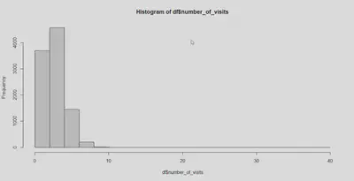
hist() function in R
Notes from the histogram:
- The most likely range of number of visits is between 2 and 4.
- It is least likely for higher values of
number of visitsto be observed. - We can also get a visual display of the “center” and the “dispersion”/“spread” of the number of visits variable.
Using dplyr package to create histograms
You could also use the popular ggplot2 R package to create histograms. If you have not yet installed the R packages dplyr and ggplot2, install and load them using the following commands install.packages() and library().
install.packages("ggplot2")
install.packages("dplyr")
#load packages
library("ggplot2")
library("dplyr")
Plotting a histogram using ggplot library.
ggplot(df, mapping = aes(x=number_of_visits)) +
  geom_histogram(binwidth = 2 ) +
  labs(title = "Histogram of number of visits")
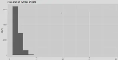
ggplot2 library in R
Numerical description of quantitative variables
We have noted that a histogram gives us an idea of where the center of the data measurement lies. It also gives us an idea about the dispersion of the measurements. In addition to the visual display, we can quantify the notions of center/spread using numerical summaries.
Mean as a measure of center
The sample mean is the most widely used measure of center. It is the average observed value in the sample. You can use the following command in R to calculate the sample mean
mean(df$number_of_visits)
The sample mean is typically represented using the notation $\bar{Y}$, where $y_1, y_2, \ldots, y_n$ are the measurements/observables of $n$ individuals in our sample.
$$\bar{Y} = \frac{\sum_{i = 1}^{n}y_i}{n}$$
The population mean about which we want to infer using the sample mean is typically represented using the Greek symbol $\mu$.
Median as a measure of center
The sample median is a value such that 50% of our sample is below it and 50% is above it. R command for calculating the median is
median(df$number_of_visits)
Both the sample mean and the median measure the notion of center of data, but they differ in how they accomplish that. Therefore, they need not always concur.
Compared to the sample mean, the sample median is not affected by extremely high or low observations in the sample.
The function summary(df$number_of_visits) can also be used to calculate the sample mean and the sample median.
REMARK: We hope that the numerical and graphical summaries from our sample (e.g., the average number of visits, average blood glucose level, etc. ) resemble that of the population from which our sample is taken from.
Measures and visualizations of spread
Visual display of spread
Two populations (or samples) may have the same mean, but have different spread.
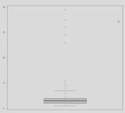
One way to visually see the spread of a data is using histogram (see above for an example). Another visual display of spread can be achieved using a box plot.
boxplot(df$number_of_visits)
Numerical quantification of spread
The most commonly used numerical measures of spread are the variance and standard deviation. Other measures of spread include range and interquartile range.
Range is the difference between the maximum observed value and the minimum observed value.
max(df$number_of_visits) - min(df$number_of_visits)
Interquartile range is the is the difference between the third quartile (Q3) and the first quartile (Q1), where the third quartile is the 75th percentile and the first quartile is the 25th percentile.
IQR(df$number_of_visits)
Bereket Kindo, PhD
Bereket Kindo’s interests include Bayesian analysis and machine learning.